Feedback

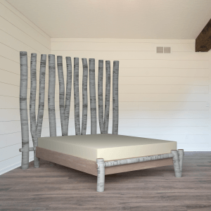
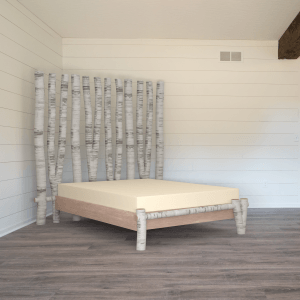
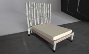
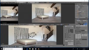
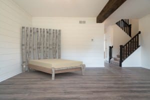
So after asking for feedback on my Artstation profile in the Facebook community and from friends, comments were positive, but most people noticed that the bed has no shadows on the walls. This made the image look less realistic, so I decided to take their comments on board, and re-render the image with the new shadows. I learned from past mistakes, and rendered out a low-res version first to make sure that my planes aligned with the walls and floor of the image.

low qual bed

They did, so I rendered the final image, which I then realised was too dark in comparison to the original image, and that the bed needed to come slightly further away from the left wall.

bed w shadows 2


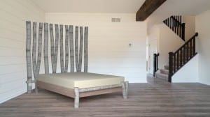
I rendered for a final time, and took it into Photoshop to clean up the wall of the image and crop, and then updated this image on my Artstation profile. Here is the before and after.

Bed (3)

bed final final


Gumroad?

In my original proposal, I mentioned that I would look into the possibility of sharing my assets with the community on Gumroad or a similar platform, but after looking into them, and much consideration, I have decided not to during this project. I have looked extensively at Gumroad and Turbosquid in particular as well as others.

I find Gumroad to be very poorly designed, and difficult to navigate. It is very difficult to find what you are looking for through the site navigation, with the only way to pull up results you are looking for being googling what you’re looking for with ‘Gumroad’ in the search also. I don’t think that the site is very user friendly, and it is a site I don’t really want to link my work with.

I liked Turbosquid much more, and it was much easier to navigate. It seems to be a much more accessible and user friendly site, and the assets available cover a huge variety of areas. I do not want to share my assets yet, as I feel as though I have not had enough time to look around at other sharing sites enough, and I would like more time to work out where I would like to share my creations. Turbosquid is definitely a site I would consider using in the future.

Although I will not be sharing my assets with the community as part of this project, it is something I plan to decide on in the future, and Turbosquid is a definite contender.

Artstation Profile

As an Artstation profile is my final output, I have created a full profile with all 3 assets, with both Sketchfab examples and a ray traced version. I have looked at many of the profiles on Artstation, from both professionals and non-professional artists. I have followed artists I like, and liked images and models which fit my interests. I have written my bio, taking inspiration from other artists to create a rounded and brief explanation of my aims and abilities. I uploaded each asset with a description, and software explanation, after hours of looking at other profiles and artworks on the site.

brogan-lawes.artstation.com

Screenshot 2017-12-13 23.46.18

Ray Tracing the Shelving

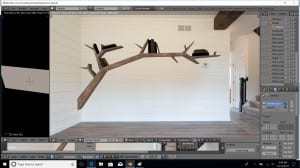
I used my Blender scene setup again for this asset, but this time, I removed the floor plane and added one to the wall behind the shelf. I changed the lighting slightly, and added the world texture as I did for the table as I found that the lighting from the world made the lighting more realistic. I then started to render this with what I thought was the same settings, not realising that I had ‘square sampling’ ticked in the render settings, meaning that the render time was around 12 hours for the 2 passes. once this had completed, I realised that my null object which my shelf was attached to had been on the first layer, but the shelf was actually on both layers, thus meaning my node tree had no effect when it came to adding the shadows in on the final composite.

b6

This was a time costly mistake, but it taught me to check everything carefully before rendering when times are that high.

I re-rendered this after fixing the layers, and also adding a plane to the second wall, as I noticed the shadows were wrong  and only on the back wall. I rendered this out, noticing that square sampling was ticked (which I then turned off). This sped up my render times to around 2.5 hours for both passes, which was a huge improvement.

with displaced shaddow

Once this had rendered, I realised that the corner of my two planes was not in the corner of the room exactly. this meant that the shadow is actually not in the corner of the room, which is an issue. I realised this, and changed it. The reason I couldn’t see it before was because it can only be seen when the plane has been removed. My solution to this is to do a very low quality render quickly to check the shadow positions before the high quality render. this may take a few minutes extra, but will save me wasting hours at a time rendering compositions which aren’t correctly lined. Once I had fixed this, my shadows aligned perfectly. I think that this is my favourite asset of the 3, I feel as though it shows how far I have come, and how much I have learned during this project.

Shelf Final

Shelving Texturing

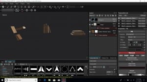
I opened the book .obj in Substance painter, and applied the ID maps. I painted in normal for the details on the edges of the pages, and baked these out as I learned in previous models. I then re-opened the book .obj with the normal maps and colour IDs and textured the books with various leather, as well as paper. I added normal details with title stamped using an alpha, with a dark colour beneath to add the darker indented details.

b3

I then opened the .obj file with the books and the shelf, and textured the shelf. I had saved each of the 5 book textures as smart materials, including the normal details with the spine details. I imported the baked normal maps for the books, along with the Colour IDs, before applying my smart materials and exporting. What I hadn’t noticed, was that the detail on the binding had not transferred over inside the smart material.

Branch Shelf (no detail)
by focusf22
on Sketchfab

Once I had realised my mistake, I figured out a way to import the textures with all details, by exporting the texture maps, then applying them as layers. This fixed the issue, but I learned it is easier to texture a model as a whole and just solo layers to work on them.

Applying Textures to a 3D Bookshelf asset from Brogan Lawes on Vimeo.


I am pleased with my final export, and I think it is of a much higher standard than the first attempt. I have used what I learned from the previous mistakes to make a nicely finished piece.


Third Asset, the Bookshelf Re-created

I really liked the design of my branch bookshelf, but I made many mistakes with it. I have decided to use the un-smoothed base model, and re-make the shelf from that point, learning from all of my previous mistakes.

I recorded this process, the video is poor quality due to around 7 hours of video being compressed.

The first stage was to create sets out of my object before smoothing. I learnt this from previous sculptures, it speeds up the selection of sides when manually UV unwrapping, and makes it much easier to get lean UVs without accidentally selecting different faces (as with my first shelf attempt).

I also selected my sets in accordance to my new UV approach. When creating the shelf before, I learned that breaking up the shell in relation to how the wood would be assembled in real life would make the wood texturing much more effective. I split the branch up into segments which wrapped around each arm, and made sure to consider the planks of  would which would be used.

The second stage was to smooth the object (after learning that doing this before UV unwrapping after smoothing makes the UVs less warped). I did this, before converting the smoothed mesh to polygons.

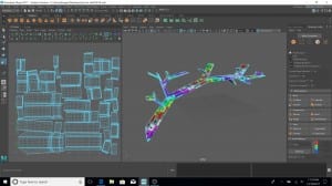
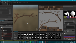
The third stage was to manually unwrap the branch, with seams at the back, or at points where two pieces of wood would join, as the textures didn’t need to match exactly here (in fact, it was better that they didn’t). I rotated each UV so that the grain would line up on the UV map horizontally.

b1

The next section was to start creating the books, which is something I decided to include in this version to make the shelf more of a finished piece. I didn’t create these last time, as it was more of a test piece, but I know that it needed more complexity and textures to it if I am using it as one of my final assets for the project. For this, I made one book, split this into two sets, and then UV unwrapped it manually.

I then duplicated and re-sized the books to lay around the shelf, before splitting them into 5 groups of books, so that I could apply 5 different textures. I made UV maps for each set, with the single colour ID (as I learned from previous experiments) so that I could then edit this in Photoshop.

b2

I exported 3 .obj files. one with the shelf, one with the books, and one with both in preparation for texturing. I also created my colour ID maps in Photoshop in preparation.


Coffee Table Reflections

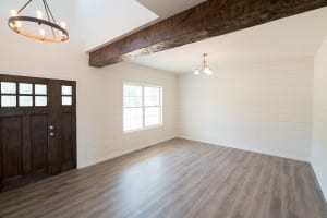
After seeking advice from the community, it was suggested that I tried adding a world texture to add more accurate reflection. I didn’t have an HDR image, but I managed to find a photo of the opposite side of the room. I also created a very rough panorama of the room from the 2 images I had, to see if I could make that work.

23679788328_7a38d91543_o

around room

I looked at a couple of helpful tutorials, but when I followed them, the results did not turn out as theirs did. They were able to see and rotate the world texture in object mode, and I was not. I tried to fix this, but found no answers online. I tried to then the photo of the other side of the wall alone instead of the ‘panoramic’ image, and although I could still not rotate it, it reflected the opposite side of the room well. I made the decision to use that, and stop searching for a solution because after a couple of hours, I still couldn’t figure it out, and I realised my time was better spent elsewhere on the project.

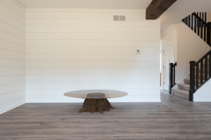
I rendered the new table out, and it is a huge improvement on the previous version. Asking for opinions and input certainly paid off.

5

table with world

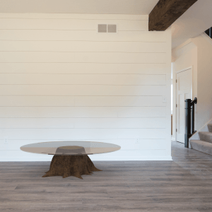
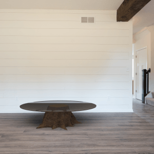
I edited the image in Photoshop to improve the composition.

table final


Coffee Table Ray Trace

So my next step was to add the coffee table to the scene in Blender. This time, I could use the scene and lighting already set-up, so this was much faster. I had to learn how to create a glass material inside Blender, and after experimenting myself, and my glass turning out a black colour, I realised I needed to research this.

table sm

I found a very useful tutorial from Easy Blender Tutorials which I followed to create a much more realistic glass.

table 2 sm

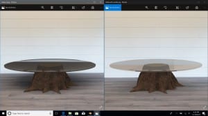
This had a lot of noise, so I experimented with different rendering, changing the sampling, and noise reduction. The Laptop I am using keeps crashing when I try to render using the GPU (which I later found out is down to my object being too high poly to render on the GPU), and there is little I can do to fix this, so I had to render using the CPU which took hours to get a noise-free render, but it worked eventually.

table 3 sm

The glass in this final render looks dark, but it is due to the reflection and refraction of the dark floor below. I’m unsure how to improve this, I will seek advice in the group on Facebook, and in the next workshop.

2nd Final Asset

So now that I have an understanding of all of the elements I need to incorporate into assets, and one asset I am happy with the result of (the bed), I need to start considering what my other two assets will be. My candlestick is a nice design, and I enjoy creating drift wood, but I feel as though it may be too simple as one of my 3 final assets. The bookshelf is something I really like, as it shows a different style, but this would need to be re-made from the base sculpture, as I have learned a lot from my mistakes since creating this first version. I also feel as though this would need some books or objects on the shelves as an addition. I really like the shape of my coffee table, and my UVs are good for this. I also really like the glass and ends of the stump, it is just the bark I don’t like. This is something I can improve now that I know more about layering textures.

Ray Trace Rendering

My next challenge was to add my bed to an image and render it out, to see how this would look in a high definition setting. Jon informed me that substance has a ray tracer built in, so I experimented with this, but struggled to get anything near the results I was hoping for. I tried various settings and setups, but had issues with scale of the model, as well as backgrounds. I tried re-exporting as .obj and .fbx files with various unit changes, but this didn’t fix the issue. Whenever I rendered, the results were very poor, even at UHD resolution, and 4K textures as seen below.

att 2 UHD


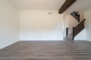
Jon then suggested I use Blender Cycles as it has a PBR  shader. I have never used Blender before, so it was a very steep learning curve. I started by finding an image on flickr to use, and found an image suitable for displaying my assets.

room

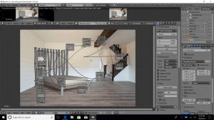
I then tried to follow a tutorial by Blender Guru, on how to add an image background to a sculpture in Blender, and Jon showed me how to add textures to the PBR shader in a workshop. I found this too fast to follow as someone who has never used Blender before, so I followed Jon’s tutorial series, which taught me a lot about how to use Blender, and I got used to the controls. I also learned a lot about using nodes as well as render passes, and my final image started to look a lot better as I tried different lighting.

2 3

I really like how my final image turned out.

bed medium

I then took this into Photoshop and edited it to make the image look less like it was downstairs, which I think improved the output.

Bed (3)

Bed Sculpture- The Result!

After fixing my normal intensity, and uploading in 2K, here is the result!

Birch Tree Bedframe
by focusf22
on Sketchfab

In this process, I have learned how to save time with many aspects through learning mistakes I need to avoid in the future, as well as learning to layer up textures to create my own.

My next step is to learn how to export this, and render a still using ray tracing, so that I can view this in 4K in a rendered setting, to check that all of the textures are correct, and to display the object for my final submission.

Bed sculpture- Texturing

After achieving the bark, I looked at other materials which fitted the style, and created the bed base, as well as adding rings to the ends of every pole. This was very time consuming, but worthwhile. I also added a cotton to the mattress as a bedsheet, and created my own stitching alpha to add stitches along all the corners.


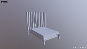
I attempted to export the object at 2K to sketchfab, and this occurred…

Screenshot 2017-12-07 13.13.19

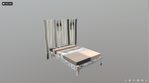
I could not figure this out, so I began to attempt to export all of my textures to my PC, then upload them as a .zip to Sketchfab. When I tried to upload, they expressed errors, in which I noticed the names of my materials did not match the names of the UVs on the .obj file. I tried to re-name the lamberts in substance back to the original names of the .obj, which was unsuccessful at first, but once I had attempted this again with the correct names for the correct files, it worked as a normal sketchfab export.

Screenshot 2017-12-07 13.14.49


I uploaded to sketchfab at 4K, which takes a long time to load and is very slow. It did make me realise that my normal detail is too strong on the trunks though, as can be seen here.

Bed Sculpture- The Silver Birch.

Now that all the sculpting and maps have been finished, I was able to move onto creating my birch bark…. This brought with it many challenges.

Screenshot 2017-12-07 15.34.50

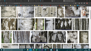
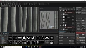
I searched and searched online for a silver birch texture but found nothing available to me. Very few people had created it, and none of those shared it. I has a substance from substance share for a trunk, which had great reviews, plus horizontal ridges which fit the Birch bark perfectly. I decided to use this as the base to my bark.

41

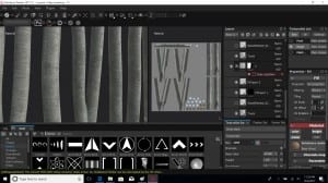
I adjusted the substance with many tweaks to reach this point, but it still doesn’t look anything like silver birch bark. It is important to remember that in home décor, birch branches are often treated to make them appear more white, grey, or silver as these colours are often preferred.

I then added more lines through normal detail, with an alpha brush to add inverted ‘scratches’. This gave the bark much more depth.

42

I left the bark at this point, as I was running out of ideas of how to make this more Birch-like, and the trunks as they were looked okay. This was not the desired effect though.

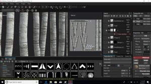
A little later, I had an idea after remembering a substance I had seen on substance share- ‘wood painted’. I applied this over the top, and adjusted many levels to create a much more birch-like material.

43

After a few more corrections to various materials, I decided I was happy with this birch material, and I’m very pleased I didn’t just give up when I couldn’t find a way to create what I had envisaged.

Bed Sculpture- Colour ID Experiment

After applying my UVs, I experimented with a different way to create my colour ID maps.

When creating the colour ID for the stump, I realised that there were issues with the edges, which I then fixed in Photoshop. This took a large amount of time, and still had issues so I tried simply painting in blocks, which proved to be successful.

Colour ID 6 Colour ID exp

When creating my UVs for the bed, I also considered the layout, by adding slight gaps or ‘buffers’ to aid the painting of the Colour ID map afterwards.

I coloured the entire object blue, and created a colour ID map for each UV map. I then took the ID maps straight into Photoshop, and simply coloured over the shapes with various colours to apply different IDs.

Mattress Mattress ID2

Bed base ID Bed base ID3

Bed head ID Bed head ID5

This worked really well, and saved me a lot of time. It meant that I didn’t have to add different coloured materials in Maya, and that I didn’t have any bleeding issues to fix in Photoshop either. This was an idea I had myself, and wanted to see if it worked out well, which it did! I will create all my colour ID maps like this from now on, as it saves time as well as making the end result cleaner.


Bed Sculpture- UVs

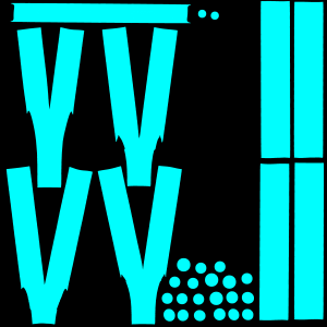
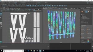
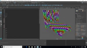
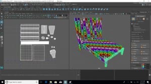
Next for the bed was smoothing, but as I learned from the stump, breaking the model up into sets before smoothing worked best. I broke everything up, before smoothing, then UVing my model. I remembered what I had learned about wood grain, and made sure I applied this to my UV layout. I split my model into 3 UV sets. The base of the bed and foot, the headboard, and the mattress. The reason I UVed the mattress separately, was so that if I choose to add bedding or pillows in the future, I can add those to the mattress UV map.

23 24 25

The whole process took many hours, but it was still a lot quicker and more efficient than previous attempts. I knew where to cut to unfold objects without visible seams, and so that they laid out without distortion.

Bed Sculpture- Proportions!

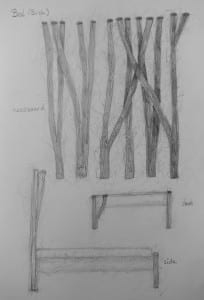
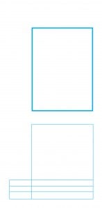
So the next sculpture I started working on was the silver birch bedframe, which was one of the more labour-intensive assets. I had my sketches, but realised that I needed the proportions to be correct, so I made a template in Photoshop so that I could line my sculpture up on every axis.

IMG_20171030_230914 bed proportions

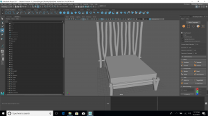
I created the sculpture, which went well, but I realised that when I created the ‘Y’ shaped trunks by combining them, which meant that the meshes interlinked and caused issues. I had the same problem with the stump, and I fixed this by deleting interlinking meshes, and adding faces between the 2 halves, which was very time consuming. This time, I fixed it by applying union instead of combine, which didn’t work at first, but after some research on techniques, and history deletion, I made this work smoothly. My mistakes took extra time, but I have now learned how to create correctly in the first place, which will make my process much quicker in the process.

22

Stump Table Feedback

I asked friends who don’t study media for feedback on the stump coffee table, as I felt that they would be able to tell me if the stump table looked realistic, without understanding how textures and sculpting work, or how I could have made the textures. This paid off, as they spotted he slight shine to the wood which caused them to question it. I then fixed this, and we agreed it looked much more realistic. Although this was an obvious fix, it was something I had overlooked, simply because I had spentso long working on the model. it was helpful to have fresh eyes.

11 12

The final version can be seen below.

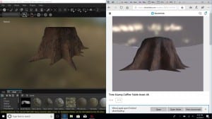
Tree Stump Coffee Table

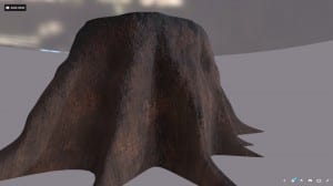
The tree stump coffee table seemed like a good asset to start to apply all of my new knowledge to, and to explore the use of new materials.

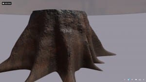
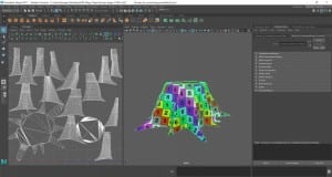
I looked into smoothing before and after UV unwrapping, and found out that it seems to work better after smoothing… this then means more selection of faces, which will make things more complicated. I decided to learn how to create selection sets, and then test if these sets still work once the object is smoothed… and they do! I created my object, created selection sets for various faces and sections of the trunk, then smoothed, before using the sets to unwrap my UV. This meant less selections, and that my selections were a lot cleaner. I did not have any issues as I did with the shelf. I also created the glass top, which worked well, and I kept this as a separate object with a separate UV so that I can use the stump separately in another asset if I wish. I also applied everything else I had learned such as correcting texel density, to prepare my model for texturing. I made sure that all of my UV faces were facing the correct way up too, as I learned with the shelf.

1


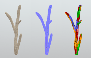
I also applied a colour ID to the top, bottom, and side of the stump, but when using this in substance, I noticed small issues with it, so I took it into photoshop and fixed it. It still had a few issues, so I experimented with painting in blocks of colour, which fixed my issues.

Colour ID 6 Colour ID exp


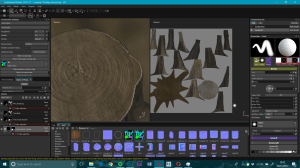
Next, my stump went into Substance Painter. I textured it using materials from substance share, and got it to an appearance I liked, with the tree rings viewable through the glass, which was the effect I was aiming for. I learnt how to apply colour ID selections to smart masks too, which helped me hugely.

Screenshot 2017-11-26 19.43.00

I tried exporting my asset to Sketchfab, and it crashed every time. I tried many things, including different exports (which came out black), exporting using various different machines, everything crashed the programme or exported with no textures as soon as I went up to 4K. Jon and I then tested this out, and we realised that one of my main textures was slowing everything down to a great extent. Even just clicking on the texture caused the entire programme to slow down, even though it had been running fine before that.

As substance share isn’t regulated, there is no knowing how well a texture has been created or optimised, other than checking the comments and the rating of the substance. This is something I need to be careful of, and aware of in the future. Some materials are really great, and are valuable when creating the look I am aiming for, but these can come at a cost. I need to start to use textures provided as layers, to build up the look I am aiming for, with materials which may not have been initially designed to do this.


Below is my final asset, I am pleased with how this came out overall, even though I couldn’t use the texture I had planned to use, and I learned a lot in the process.

What Will My Output Be?

As I am learning more about the actual creation of assets, I’m learning more and more about where the type of things I want to create fit into the market. My original aim was to create assets for game engines, so they need to be low poly. In this journey, I have learned how to create high and low poly objects, and why low poly objects are used in gaming. As I started to search for my gap in the market, my subject became more of a photo-real, organic piece. I feel as though the style and look of assets I am creating would be more suited to 3D visualisations of properties and interiors, rather than gaming. I could create low poly versions of the models I am starting to create, but these would become more stylized, as my models have many curves to them, due to working with the natural shape of wood.

Game engines nowadays can handle tri-counts in the millions, so my assets could still be used in game engines, though I feel like my aims no longer fit this.


Below, is my original project proposal (in blue). This has now changed in many ways, which I will point out below (with green corrections).

Assets for portfolio project. The intended aim for this project is to produce three, high quality prop assets in various styles for my portfolio, which I will also consider putting back into the community with a sharing site such as Gumroad. After reading about how to enter the game environment industry, I have learned that this is something a portfolio should include.
My individual objectives are as follows:

– Learn how to use Zbrush or Maya (or both) after researching which software I need to learn.

– Design 3 assets in different styles.  (After my initial ideas when looking at what was missing in available assets, I realised that it was better to create assets which follow a theme, in a similar style, but using different woods and materials in order to showcase different skills)

– Learn about creating assets with textures for game engines.

– Create 3 assets in one or both programmes.

– Texture 3 assets in Substance painter.

– Bake 3 assets down to a low poly mesh for gaming.  (I have explored baking textures and have learned how to do this, but I  don’t feel as though I need to display this with 3 assets. I have found that painting normal in Substance is sometimes more effective, and that I don’t always need to bake assets, though it is an option I now know how to use).

– Create the first half of a show reel, based on research of what other artists have done. 

– Display the show reel on an Artstation page.

– Create a Sketchfab example of each for my Artstation page.  (This will now be an Artstation page with my assets available to view in a 360 view via Sketchfab. I also plan to create stills of my models, either as screenshots from Sketchfab, into Photoshop, or as still renders in 3DS Max if possible.)

– To look into sharing my assets with the community as a possibility.

I have chosen the portfolio strand, as I feel this will allow me to research what I need to do, develop my 3 assets and textures, changing them along the way as I learn more, before presenting them as the asset part of my show reel.  (Artstation page).

My idea is to create and texture 3 assets ready for a game environment, and to create the asset half of my show reel, as suggested by senior 3D/Environment artist, Robert Hodri in his article ‘Everything You Need to Know to Become a Game Environment Artist’ on Artstation. I will consider also allowing people to use my assets through a site such as Gumroad. (This has now changed to a more 3D  interior visualisation aim, which will be more focused on ray trace rendering or game engines (but high-poly and with a final output as stills), this is something I will look into more for my second projects, but for now, my assets need to be realistic, and able to run on different platforms.)

My intended audience is employers in the Game Environment (3D visualisation, commercial) industry.

The final form of the output will be a short video breakdown of the 3 assets (both high and low poly), which will be half of my show reel. I plan to publish this on an Artstation profile I will create, as well as possibly sharing with the community. (The final output will be an Artstation page with my assets available to view in a 360 view via Sketchfab. I also plan to create stills of my models, either as screenshots from Sketchfab, into Photoshop, or as still renders in 3DS Max if possible. I will look into sharing my assets with the community).

This project will extend my creative and technical skills, by challenging me to draw and design my own assets, thinking about the styles I want to apply to each. It will teach me to sculpt my ideas, and texture them. It will expand my technical knowledge of the software used in the industry I aim to break into, as well as teaching me how to create assets for games versus the film industry.


I will now create assets, with more focus on the realistic graphics and less focus on making them as low poly as possible. I also plan to explore more textures with this.

Manual UV challenge

Today, I continued sculpting my shelf on a different laptop. I then unwrapped the UVs manually, which went fairly successfully. I had decided to UV unwrap before smoothing, as this meant less selection, though I am unsure if this was the correct way of doing things, as my UVs warped slightly.

I used what I had learned from tutorials, and unfolded my shelf, hiding seams. I then laid these out into a UV map and exported this to Substance. I textured my Shelf, and it came out okay, but I am not entirely happy with it. It is certainly a huge improvement on what I was creating before. there are a couple of small areas where I selected the wrong part of the mesh when unwrapping, which caused two of the shelf surfaces to attach to the sides of the branch. this didn’t have too much of an effect on the final product, but it is something I need to be careful of in the future.

Screenshot 2017-11-24 23.31.37

I learnt an important lesson when it comes to wood. I must lay out my UVs so that the grain can follow the same direction. This worked well with the surfaces of the shelf, and I had thought that having the sides the right way up would be correct, but I realised that this meant the grain goes from left to right across the entire shelf, rather than following the direction of the wood. This means that I need to take into consideration how the wood would have been put together when building the real thing, and cutting the UV up into the planks and pieces it would be made of so that they can all line up with the grain going the same way on the UV map.


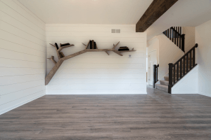
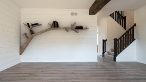
I like the overall shape of the shelf, but I do not like the end result of the texturing and UV unwrap. If I am to use this as one of my final assets, I will need to re-do the UV and re-texture from there. If this is used as a final asset, I will also need to add some books and possibly a candle to show off my asset to its full potential.


Action points

  • Look into the difference between unwrapping before and after a smooth
  • Find a way to make my surfaces easily selectable so that I don’t accidentally select sides
  • remember to consider how an object will be made in the real world, so that I can slpit UVs accordingly
  • Re-make the shelf from the point of smoothing onwards if I plan to use this as a final piece.

This Week’s Update….

This week has been a rollercoaster.


I have drawn more asset ideas, as well as adding many more ideas to my pinterest ideas board which can be found here.

IMG_20171123_154153IMG_20171123_154158

IMG_20171123_154213_01IMG_20171123_154223

IMG_20171123_155009


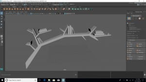
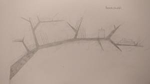
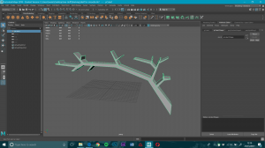
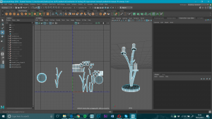
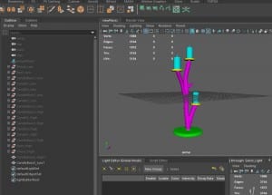
I have started to sculpt some new pieces in Maya. This Shelf has been created in Maya 2018 and is just basic shapes.

Screenshot 2017-11-23 15.10.43

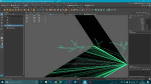
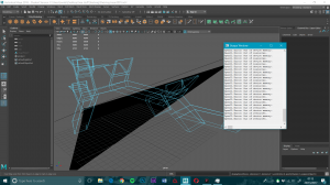
I then attempted to  smooth the object for soft edges and everything went wrong. Maya glitches and crashes whenever I attempt to smooth in 2017 and 18, in all manner of ways. it has been impossible to make any progress with smoothing using my laptop.

Screenshot 2017-11-19 23.35.25

Screenshot 2017-11-20 01.13.31

I have contacted as many people as possible for help, from Tutors, to IT services, to Autodesk. Many had never seen issues like this before and couldn’t help. After around 24 hours worth of testing, trying, battling with software, going to see different people for advice, I have come to the conclusion that the graphics card in my laptop just isn’t powerful enough.

I also tried opening a .fbx file of the object in blender, this was corrupt and had file errors. I also tried this with .obj, which did open without an issue. When transferring my object to another machine, I will be using .obj for this reason.


Screenshot 2017-11-23 15.46.55

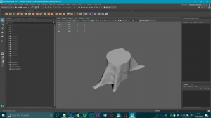
I also started sculpting a stump, which I had to do in 2017 as the move, rotate, and scale tools stopped working. I will stick to Maya 2017 now, until this is fixed as I found everything else to be fine in 2018 so far.


I have learned to never assume that everything will go smoothly with software, so I will make sure to leave myself time for my project for any issues.


Glass Experiments

I decided to attempt some glass in Substance, as this is something which is fairly newly accessible, and glass works well with natural wood because it allows you to see the wood in things such as tables and shelves.

Screenshot 2017-11-14 00.07.44

I started by attempting a glass pane, which was moderately successful. I used ‘glass dirty’ which was downloaded from Substance Share, and I lowered the dirt to almost nothing. This worked fairly well, but was hard to see properly in Substance as it was so flat.


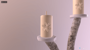
I then attempted to apply glass to the candlestick. This worked, but the joins in shapes are a little too messy, meaning that the wood can be seen through the glass, with small glitches of textures.

Driftwood Candlestick
by focusf22
on Sketchfab

When creating further models, I need to make sure I am careful about where edges of different materials meet, so that I can make the colour ID as accurate as possible. I will also edit any anomalies in my colour ID map in Photoshop before importing it into Substance Painter.

Normal Issues

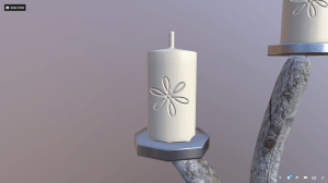
After asking for feedback and ideas on what the issue may be with my candlestick in a Facebook group, it was suggested that my normal map was the issue. on closer inspection, I realised this was an issue in the high poly mesh I had baked in.

Screenshot 2017-11-16 17.31.59

I fixed this by editing my normal map in Photoshop, and starting again in substance painter. This fixed my issues completely.

Driftwood Candlestick
by focusf22
on Sketchfab

I have learned to check my baked normal map first and edit it if necessary before I start painting in Substance.

Lower Poly and Better UVs.

This week was a test of all of my past experiments in one, followed by learning how to manually unwrap UVs, and about why texel density is important.

I started off by watching a few helpful tutorials about UVs here, here, and here. Once I understood the basics, I decided to create a new, lower-poly candlestick using cylenders instead of smoothed cubes. this reduced my polycount greatly on my driftwood, but made it higher on the candles and bases. This however, seemed justified, as it made the circles much smoother than before.

Unreal can handle about 2bilion polys per scene, so 3k isn’t much in comparison.

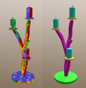
I created my candlestick, and then created a high poly version, a colour ID map, and created UVs considering texel density. the UV for this model was a huge improvement on past tests, due to applying all the things I have learned, including history deletion. you can see the process below.

Low-Poly Candlestick Creation from Brogan Lawes on Vimeo.


After, I imported everything into substance, hand painted normals, textured it, and exported the model out to Sketchfab. Throughout the whole process, I thought that the model was looking to be a huge improvement on past attempts, and normal painting and texturing was a lot cleaner with all of the previous issues fixed. Frustratingly, the candles appear to have an issue, and I am unsure why. This is something I need to look into further.


Low and High poly normal painting

A short experiment- I did 2 quick tests. One object with hand painted normals in substance, with the low poly candlestick. One object with hand painted normal in substance, with a blank (smoothed) high poly mesh baked first onto the low poly candlestick. I have concluded, that normal resolution is greatly improved when painted onto a baked high poly normal map.

Without high poly mesh baked first:

Screenshot 2017-11-10 22.46.48

Colour ID UVs

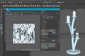
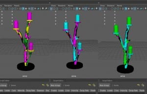
For this test, I have taken my candlestick, and attempted to follow this tutorial, to apply colour ID to my UVs. After a lot of searching, I found that many tutorials were out of date, so I had a limited pool of knowledge to learn this, and I struggled. my first 3 attempts were all a disaster. I tried various UV maps, and struggled to get all of my objects onto one UV map. I successfully reached this point after a great amount of trial and error.

UV 4 (Whole object)

After following the tutorials again and again, I ended up with a very similar result, even though each attempt, I altered UVs, and even tried just using exact duplicates for high and low poly to make sure the colour ID applied correctly. None of this worked, and I took a break.

uv ATT. 1, 2, and 3

After a short break, I noticed that the tutorial only had one object for both high and low poly, whereas I had eight objects for each. I decided to combine all the low and high poly meshes into one high, and one low, before UV unwrapping, and after colouring the high poly meshes. I then followed the tutorial through with my two meshes, and was successful.

uv ATT. 4

Unwrapping my UV as a whole also made the branch unwrap a little more cleanly. I uploaded the un-painted .fbx to Sketchfab here, to show the new UV results. Although these are still a little messy, they are an improvement on the last attempt.

Screenshot 2017-11-09 13.39.13


I then imported my Colour ID map into Substance, and applied this, following this tutorial.


This week, I have come to realise that although I have improved my UV projections, there are still many issues.

These include;

  • Stretching of UVs which cause distortion
  • Low resolution UVs, even with a 4K map
  • An unclean automatic UV unwrap

Jon has pointed me in the direction of some helpful tutorials, so my next step will be to better improve my UVs, including learning about texel density.


Improving UVs

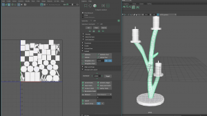
After my normal painting experiment, I realised that my UV was causing issues. I tried to correct this, by using a 12 plane projection map rather than 6.

UV att. 1, 2, and 3 map

This improved things slightly, and I was able to create a candlestick with much better normal detail, as it flowed better. I do, however, think that this could still be improved.

I did find that my textures seem quite low res, even though my maps are 4K. This is something I need to explore to find a way to stop this.
 

Learning normals

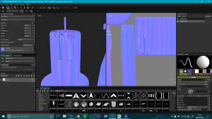
I decided to take the low poly wood mesh of my candlestick into Substance, to practice painting normals. I followed a simple tutorial  which helped me to understand how to do this, and I realised I didn’t have the brush I wanted. I needed a simple straight split, as driftwood often has this, and little other detail due to it being smoothed by the sea. I followed this tutorial, and created my own alpha brush to use.

I then applied a material on top, and adjusted the settings to make it look more like driftwood. I realised during this process, that my UV was really messing up my normal painting and textures, so this is definitely something I need to look into next. I feel as though I successfully learned the basics of hand painting normal maps inside substance painter.

I am pleased with the result, though when I checked the UV, Sketchfab made it clear how strange my map is. this will be my next task.
Screenshot 2017-11-06 00.13.15